
MyDiscovery
Redesigning a financial projection tool to increase efficiency and improve usability
Overview
Problem
Financial advisors struggled with MyDiscovery—it was slow, unintuitive, and hindered productivity.
Solution & Outcomes
I led a full redesign that streamlined navigation, cut task completion time by 36%, and boosted satisfaction to 92%, as reflected in post-launch surveys.
Current State
👎
Navigation Overload
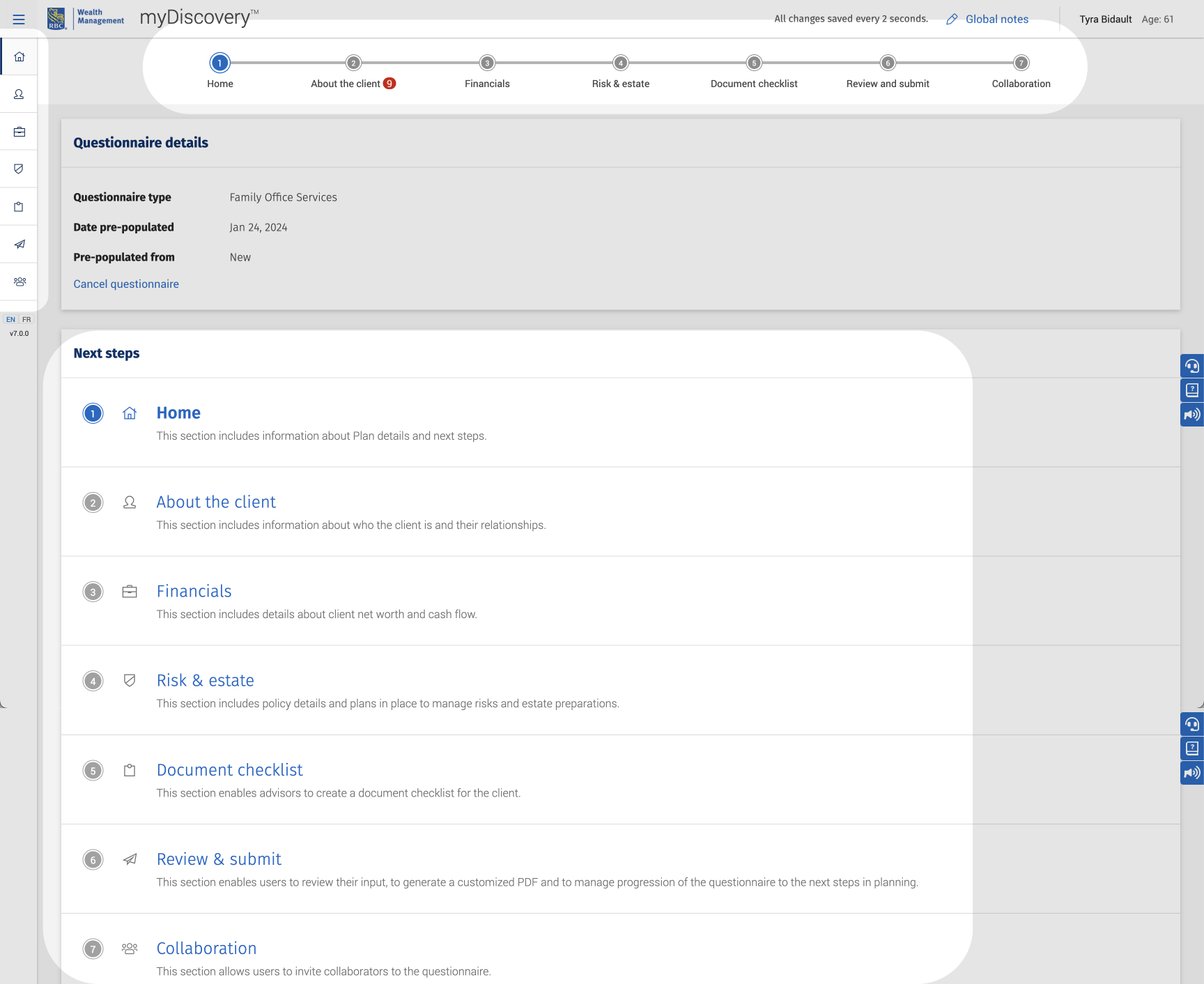
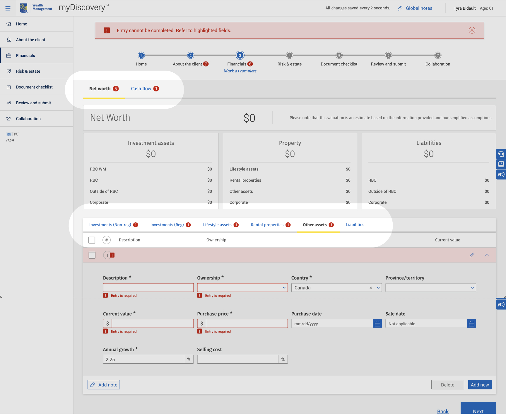
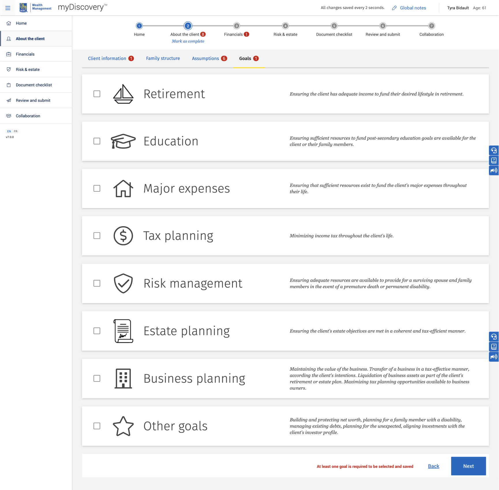
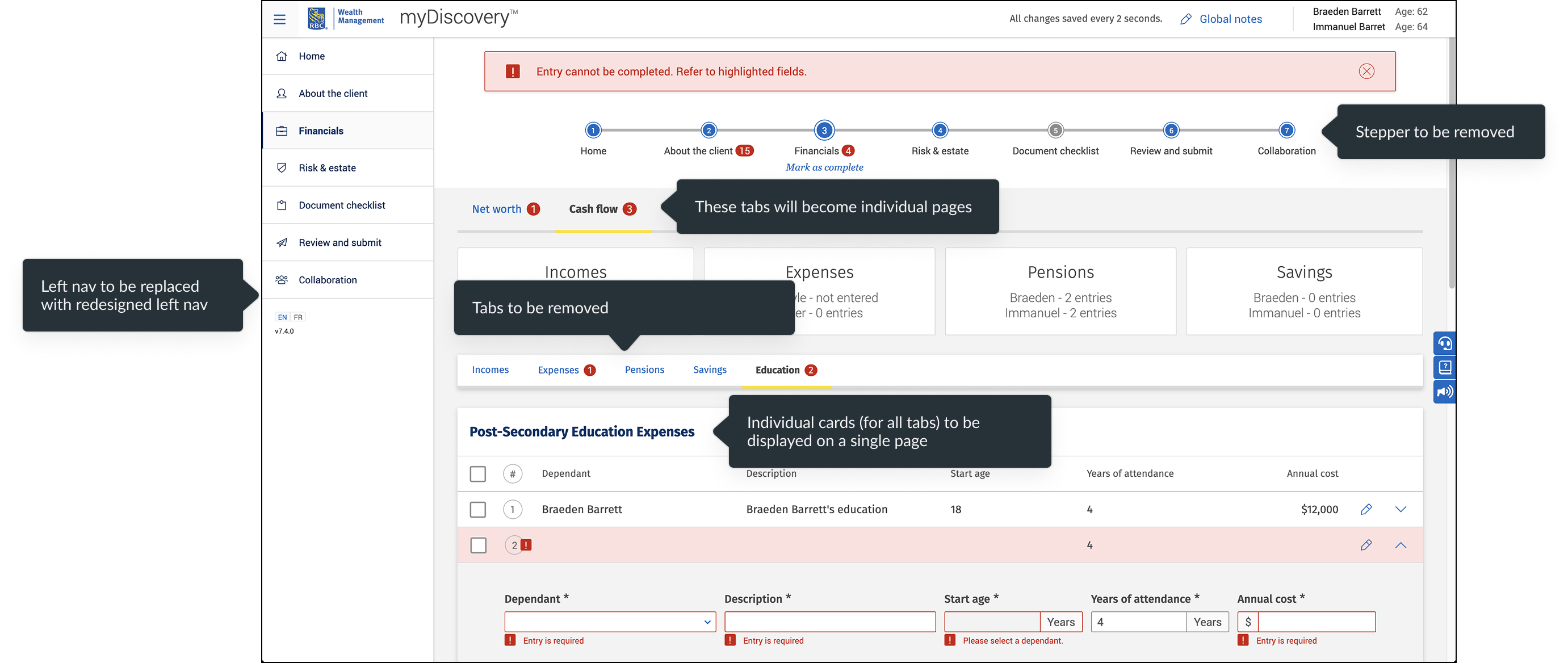
Three competing navigation patterns (side icons-only, top tabs, nested tabs) made it difficult for users to orient themselves.
The top navigation implied a strict step-by-step flow, even though users could move freely. This mismatch between design and functionality confused advisors.
👎
Poor Discoverability
Locating specific sections often required trial and error. Without knowing where a third-level item lived, advisors had to click through multiple top- and second-level tabs just to find it.
👎
Visual Confusion
Inconsistent text sizes and button hierarchies created visual noise, forcing advisors to work harder to scan, prioritize, and take action.
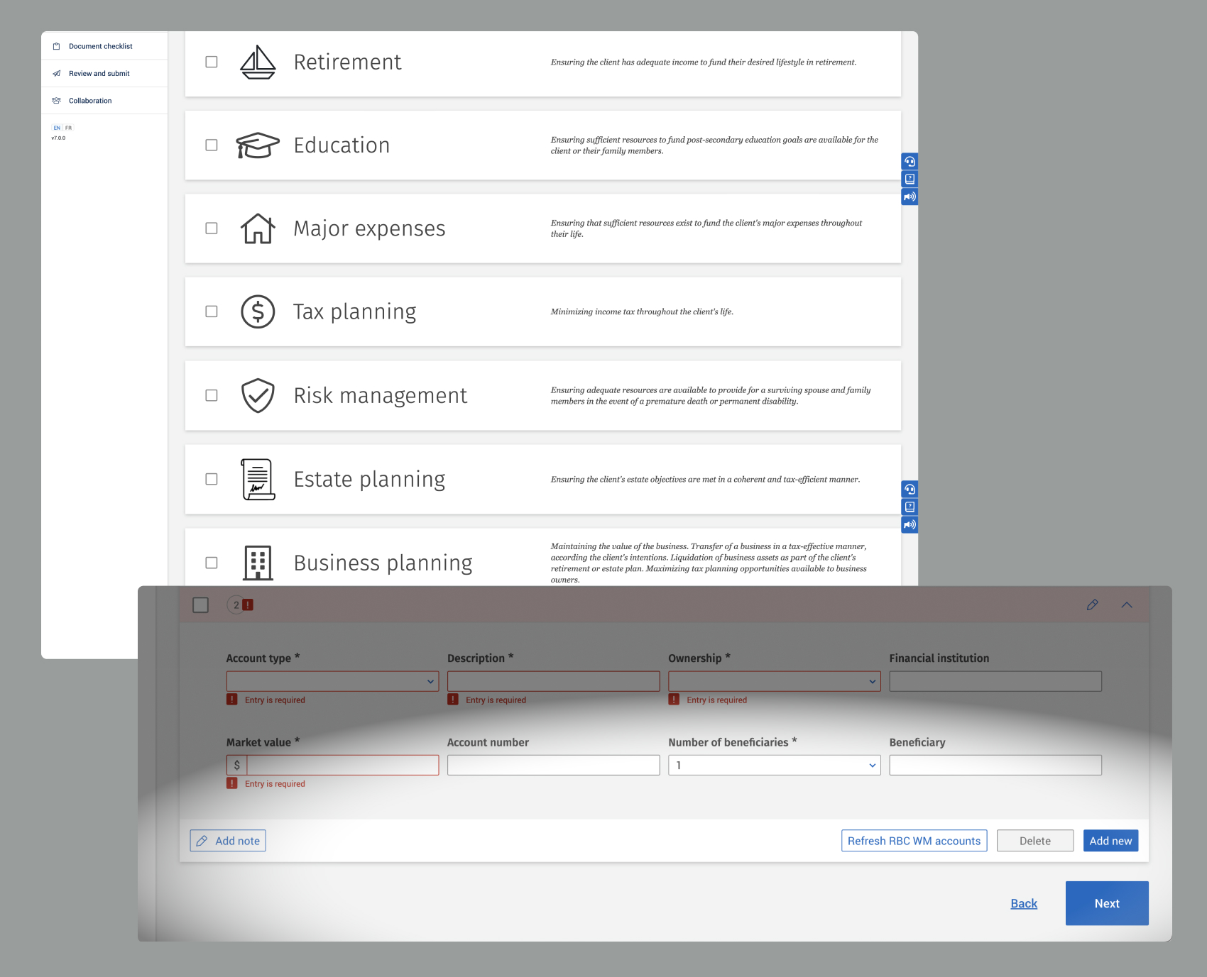
Lack of visual hierarchy
Inconsistent text size create cognitive overload
Ineffective Layout
👎
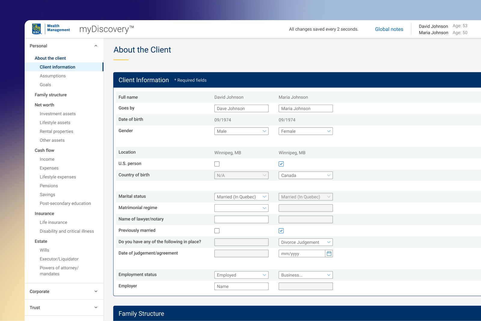
Inefficient Input Design
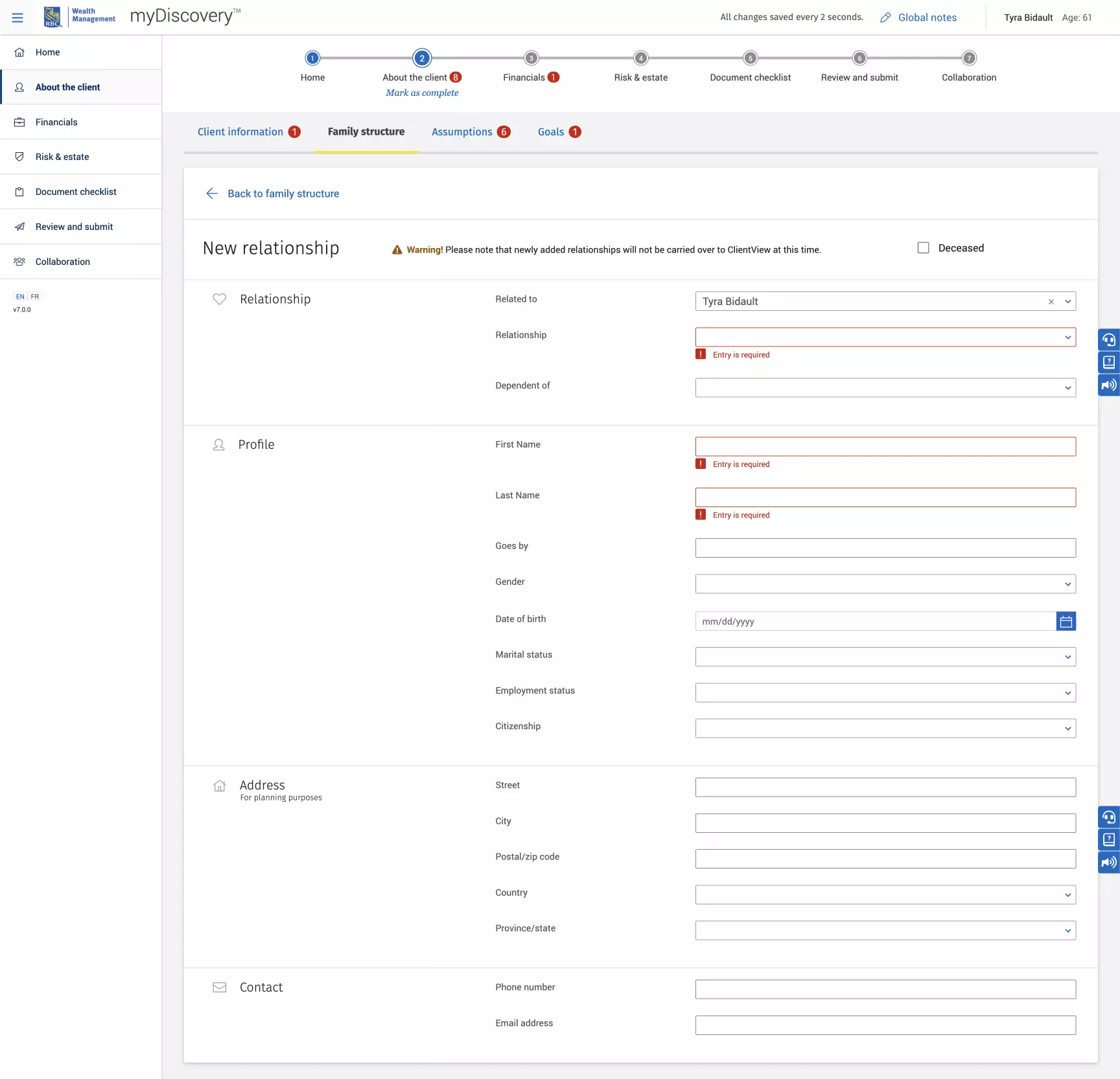
Input fields weren’t optimized for the type of data being captured. Short entries were given long fields, dense sets of fields lacked grouping, and overall the layout made data entry cumbersome and error-prone
👎
Limited Data Visibility
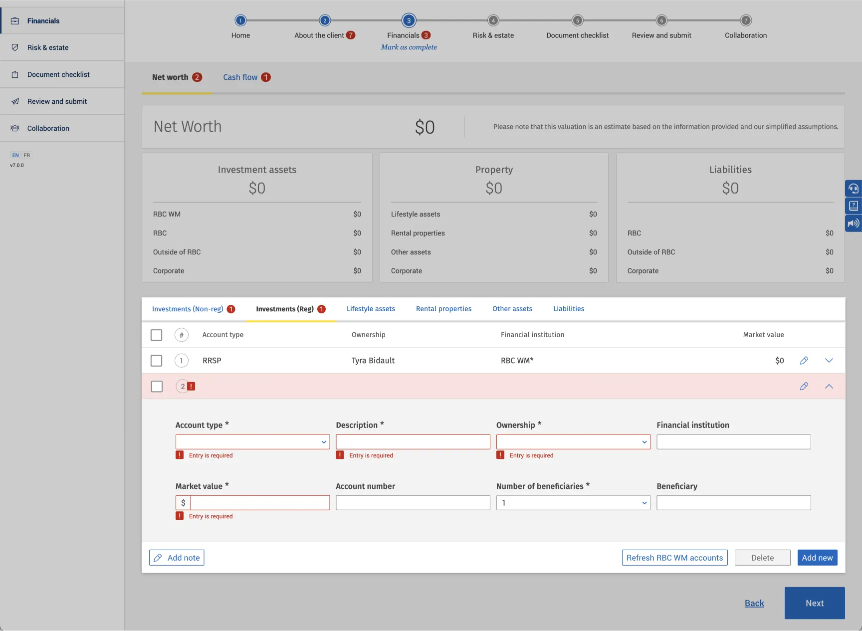
Key information was buried in dropdowns. Because only one item could be expanded at a time, advisors couldn’t compare line items side by side. They wanted something closer to a spreadsheet view rather than an accordion.
The Redesign
Revising the information architecture
We reorganized the app into three top-level domains — Personal, Corporate, and Trust — aligning the navigation with the natural flow of client conversations. Advisors could stay focused on one area of a client’s finances without being distracted by unrelated sections, then move to other domains as the discussion progressed.
Information was better organized around the advisor–client dialogue, making reviews more streamlined and less fragmented.
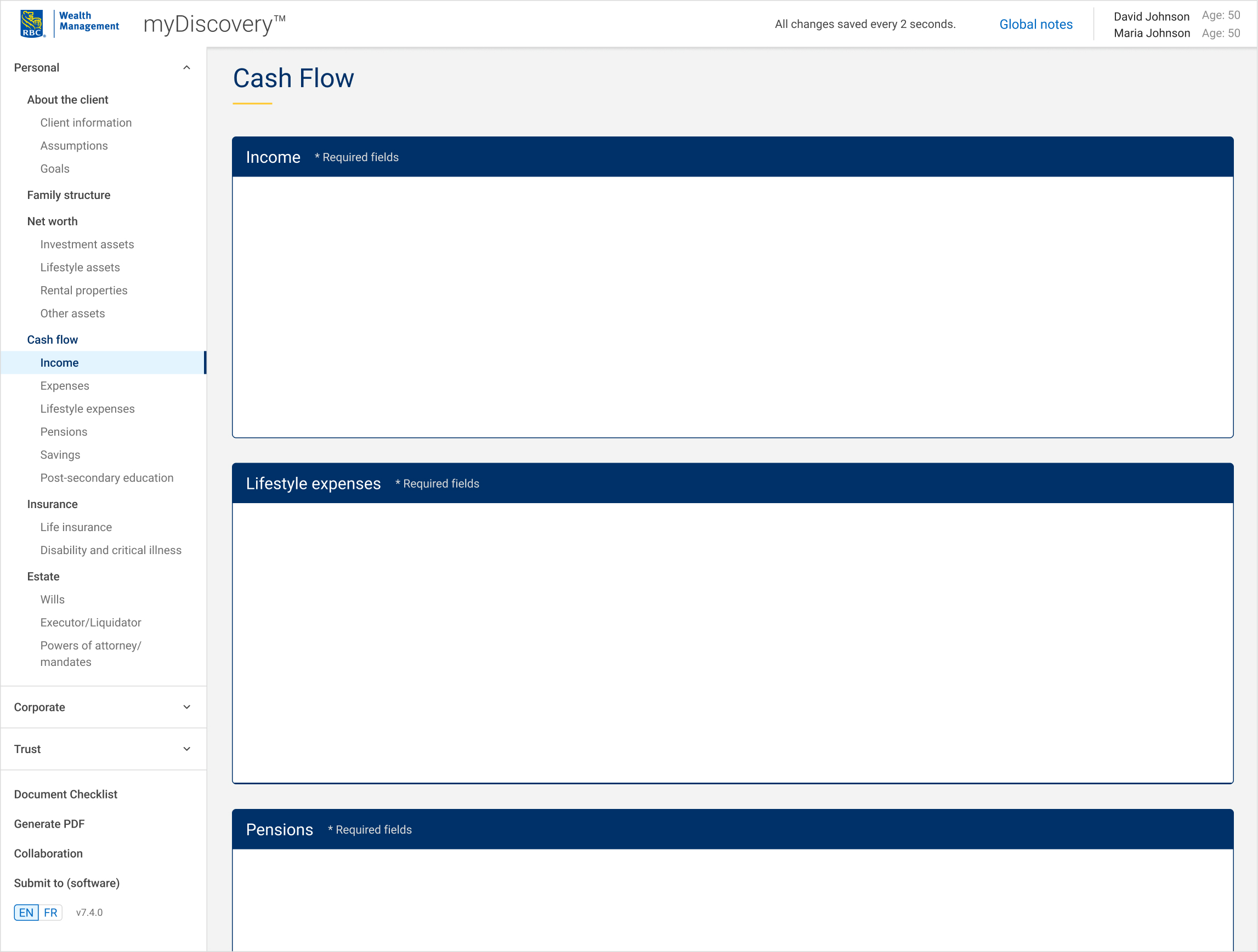
Restructured Navigation for Clarity and Efficiency
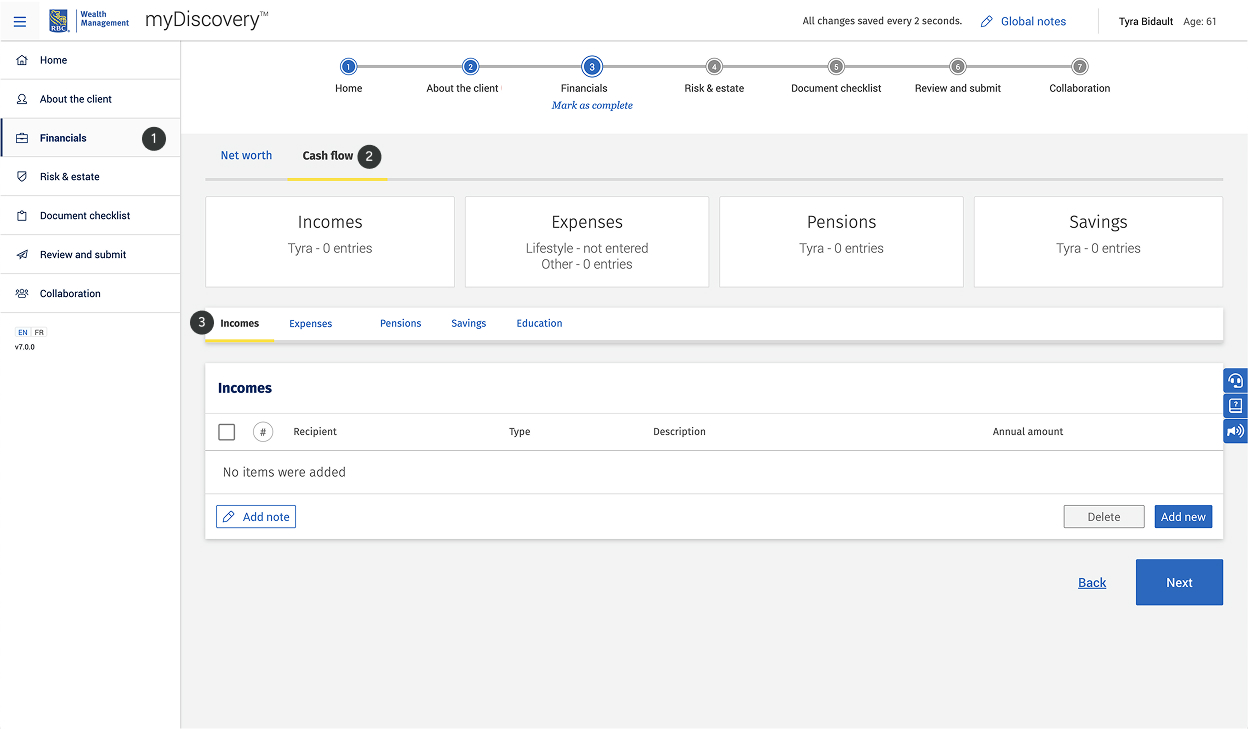
I surfaced level-two sections as modular cards directly on the page. Advisors could now view all sections at a glance and jump freely between them, without unnecessary clicks or trial-and-error.
Navigation became faster and more predictable — for example, the “Incomes” card dropped from three clicks to just one within the Personal domain.
👎
3 clicks required to reach the "incomes" card
👍
Only 1 click required to reach the "incomes" card
Streamlined Inputs and Improved Data Visibility
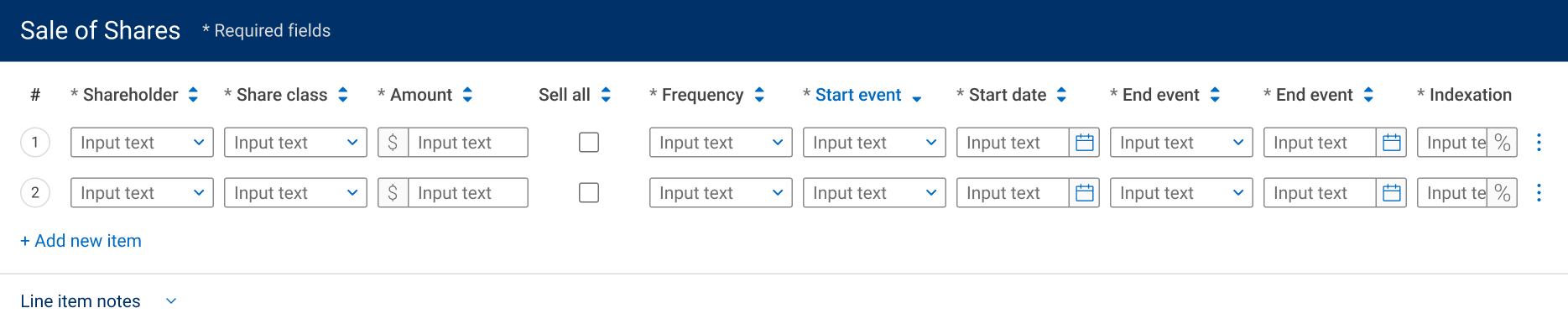
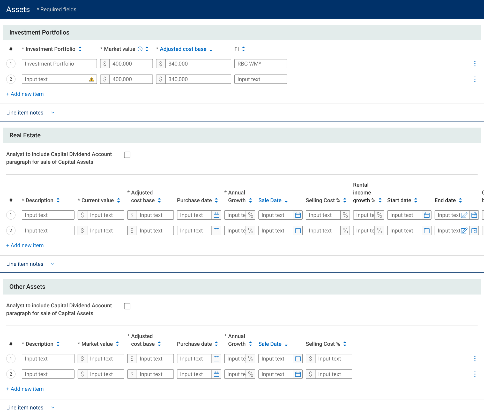
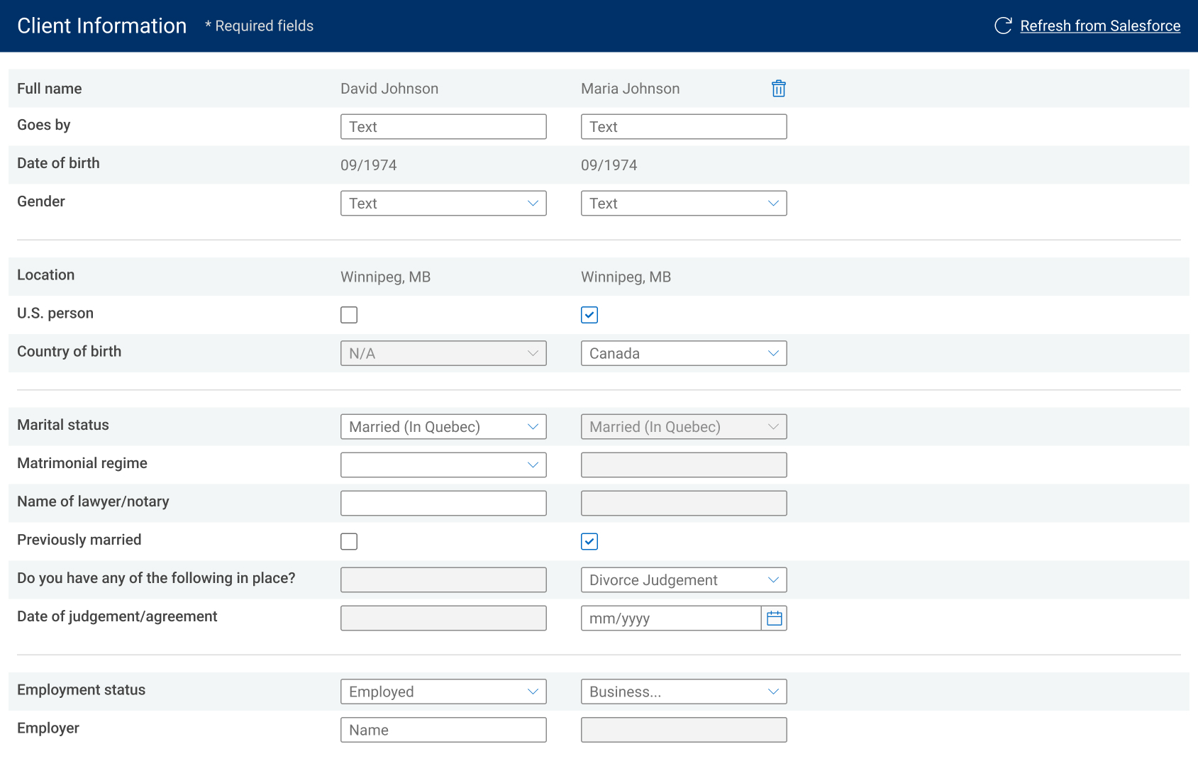
Inputs were redesigned to match the type of data being captured, and accordion dropdowns were replaced with spreadsheet like views that supported comparison.
Data entry became faster and less error-prone, and advisors could finally view and compare key financial information without constantly expanding/collapsing sections.
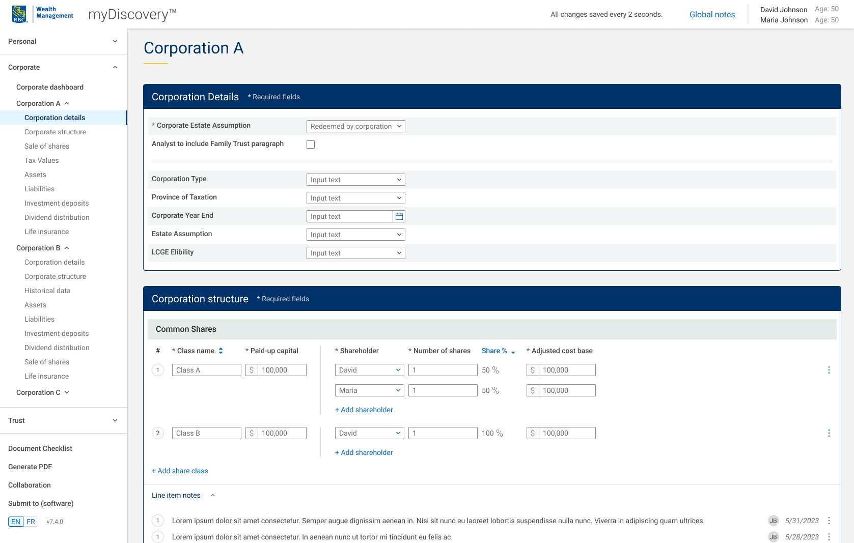
For form like information like client details

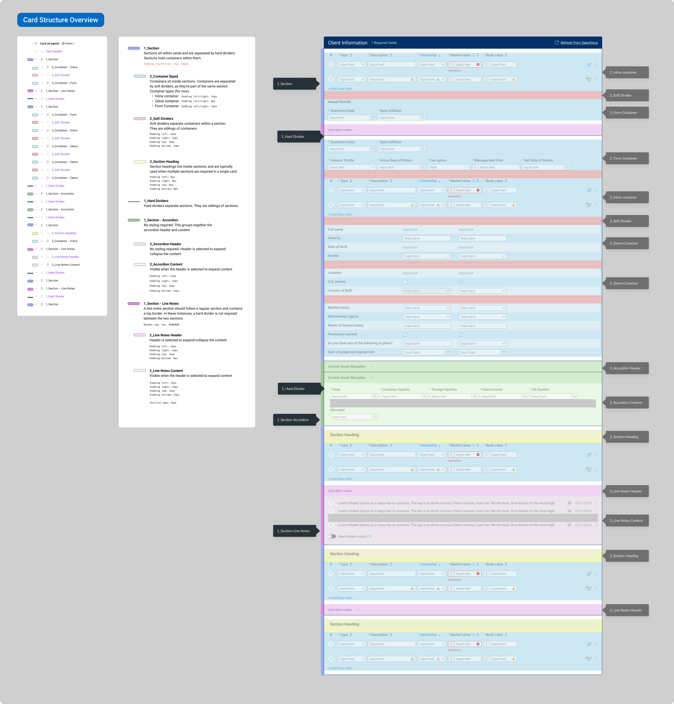
I built a card design system to speed developer handoff and simplify the design process
I created a reusable card-based design system with consistent rules for hierarchy, spacing, typography, and CTAs.
This not only maintained consistency across the application, but also reduced design time, streamlined developer handoff and ensured future scalability.
Project Outcomes
😀
⏱️